User research and UX definition for a pharmacy members platform
Responsibilities
- Qualitative member research
- Stakeholder consultation
- Roadmap prioritisation
- UX definition
- Ui design
- Evaluative testing
Project overview
Numark Pharmacy provides a members platform that is used by busy pharmacists to benefit from a wealth of content, resources, advice, documents and member incentives.
The platform was over 10 years old and had continually been updated with little consideration for the overall user experience. Members had reported the platform as difficult to use and find content.
The aim of this project was to dig into member needs to optimise and future proof the platform.
Qualitative interviews were planned
Research insights were supplied but didn’t contain enough relevant digital information so running member interviews allowed us to dig into member needs.
Although we had a limited number of members, the insights they gave enabled us to build a better picture of what their typical day looks like, how often they interact with the portal, what features and content are important to them, where improvements were needed and what our priorities were for ideation and testing.
Member frustrations were documented
Members reported the following fundamental issues and functionality that hindered their day to day workflow;
- A clunky interface
- Slow to load
- Difficult to find content & resources
- Poor site search
- Messy navigation
- Product catalogue not exhaustive
- Difficult for admins to add content
- Convoluted member registration process
- Inconsistent experience across Phoenix Medical platforms
- Not device responsive
Core functionality was explored
A split content and product site search was explored, a completely re architected navigation was established and and a 1 click product ordering journey was devised all with member needs in focus.
Search proved a key feature to get right. Initial concepts trialled a separate product and content search but members fed back this to be confusing, so a more intuitive site search with filters was established.
Several iterations of wireframes were created and evaluated with the internal team before running some online member usability evaluation sessions. This approach highlighted a few early issues with product and content search which allowed the concepts to be refined in line with member needs.
Crafting a member first platform
Utilising the design system we’d previously created for use across the Phoenix Medical digital estate we could now rapidly create the UI designs in line with the Numark brand to fully align with member needs and brand aspirations.
Some further stakeholder and member usability research was carried out to address final feedback before the platform was given the board sign off and progressed to development.
Tailored members dashboard
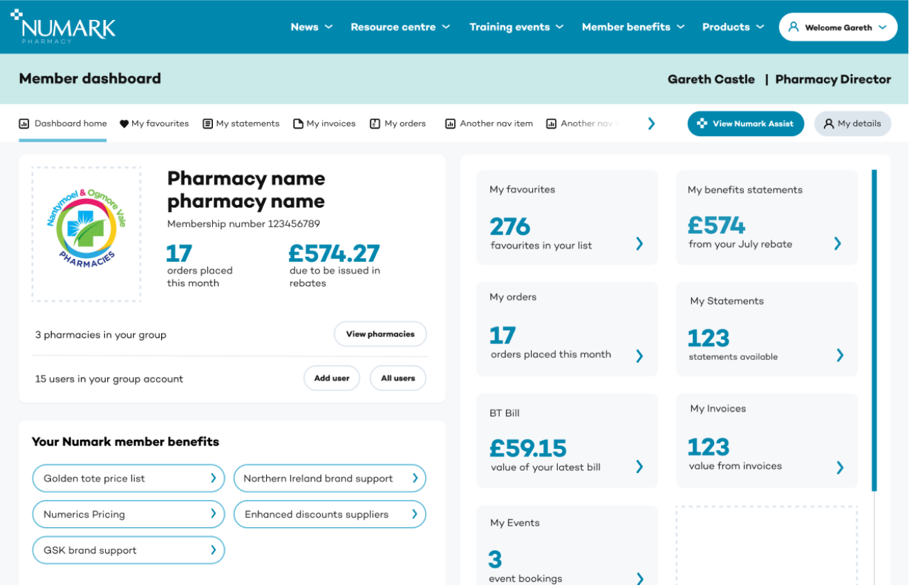
Self serve documents

Product ordering through search

Logged in members quick access

Let’s work together
If you’re looking to partner with a studio who wants the best digital experience for your customers, we’d love to chat.

Email: dan ( @ ) pushpull.digital
Let’s work together
If you’re a customer centric business and you’d like to discuss a project or need help embedding the right UX processes into your business let’s talk.
dan ( @ ) pushpull . digital
Platform, New Station Street, Leeds, LS1 4JB